Integrated ChIP-seq Data Analysis Workshop
Source:vignettes/IntegratedChIPseqAnalysisWorkshop.Rmd
IntegratedChIPseqAnalysisWorkshop.RmdThe Docker container (https://hub.docker.com/repository/docker/hukai916/integratedchipseqanalysis_workshop) with this workshop has pre-installed dependencies. If you are not using it, you must install the following packages.
Load required libraries
suppressPackageStartupMessages({
    library(ChIPpeakAnno)
    library(trackViewer)
    library(biomaRt)
    library(AnnotationHub)
    library(EnsDb.Hsapiens.v75)
    library(TxDb.Hsapiens.UCSC.hg19.knownGene)
    library(BSgenome.Hsapiens.UCSC.hg19)
    library(org.Hs.eg.db)
    library(UpSetR)
    library(seqinr)
    library(motifStack)
    library(WriteXLS)
    library(rtracklayer)
    library(rmarkdown)
    library(knitr)})
Example1: annotate ChIP-seq peaks with ChIPpeakAnno
Four steps:
Read in peak data with
toGRangesGenerate annotation data with
toGRangesAnnotate peaks with
annotatePeakInBatchAdd additional info with
addGeneIDs
Step1: read in peak data
We first need to convert peak files from bed/broadPeak/narrowPeak etc. format to GRanges object with toGRanges function.
For the demo, we will use the example data stored in ChIPpeakAnno package.
## locate example data:
path <- system.file("extdata", "Tead4.broadPeak", package="ChIPpeakAnno")

## read in peak file:
peaks <- toGRanges(path, format="broadPeak")

## inspect the top 2 lines of the peak file in GRanges format:
head(peaks, n=2)
## GRanges object with 2 ranges and 4 metadata columns:
##             seqnames        ranges strand |     score signalValue    pValue
##                <Rle>     <IRanges>  <Rle> | <integer>   <numeric> <numeric>
##   peak12338     chr2 175473-176697      * |       206      668.42        -1
##   peak12339     chr2 246412-246950      * |        31      100.23        -1
##                qValue
##             <numeric>
##   peak12338        -1
##   peak12339        -1
##   -------
##   seqinfo: 1 sequence from an unspecified genome; no seqlengths
Step2: prepare annotation data
Depending on your research goals, you can choose to use either ENSEMBL or UCSC annotations.
The more complex ENSEMBL annotation is preferred when the goal is to discover and explain unknown biological mechanisms.
The less complex UCSC annotation can be used to generate more robust and reproducible results.
library(TxDb.Hsapiens.UCSC.hg19.knownGene)

annoDataTxDb <- toGRanges(TxDb.Hsapiens.UCSC.hg19.knownGene)

## inspect the first two lines of the annotation file:
head(annoDataTxDb, n=2)
## GRanges object with 2 ranges and 0 metadata columns:
##      seqnames            ranges strand
##         <Rle>         <IRanges>  <Rle>
##    1    chr19 58858172-58874214      -
##   10     chr8 18248755-18258723      +
##   -------
##   seqinfo: 93 sequences (1 circular) from hg19 genome
Step3: annotate peaks
## annotate by the nearest TSS based on UCSC hg19 annotations
annoTxDb <- annotatePeakInBatch(peaks, AnnotationData=annoDataTxDb)

## inspect the first two lines of the annotation:
head(annoTxDb, n=2)
## GRanges object with 2 ranges and 13 metadata columns:
##                   seqnames        ranges strand |     score signalValue
##                      <Rle>     <IRanges>  <Rle> | <integer>   <numeric>
##   peak12338.26751     chr2 175473-176697      * |       206      668.42
##   peak12339.26751     chr2 246412-246950      * |        31      100.23
##                      pValue    qValue        peak     feature start_position
##                   <numeric> <numeric> <character> <character>      <integer>
##   peak12338.26751        -1        -1   peak12338       26751         218136
##   peak12339.26751        -1        -1   peak12339       26751         218136
##                   end_position feature_strand insideFeature distancetoFeature
##                      <integer>    <character>   <character>         <numeric>
##   peak12338.26751       264810              -    downstream             89337
##   peak12339.26751       264810              -        inside             18398
##                   shortestDistance fromOverlappingOrNearest
##                          <integer>              <character>
##   peak12338.26751            41439          NearestLocation
##   peak12339.26751            17860          NearestLocation
##   -------
##   seqinfo: 1 sequence from an unspecified genome; no seqlengths
Step4: add additional annotation
library(org.Hs.eg.db)

## add in gene symbol
annoTxDb <- addGeneIDs(annoTxDb, orgAnn="org.Hs.eg.db",
                        feature_id_type="entrez_id",
                        IDs2Add=c("symbol"))
## inspect the first two lines:
head(annoTxDb, n=2)
## GRanges object with 2 ranges and 14 metadata columns:
##                   seqnames        ranges strand |     score signalValue
##                      <Rle>     <IRanges>  <Rle> | <integer>   <numeric>
##   peak12338.26751     chr2 175473-176697      * |       206      668.42
##   peak12339.26751     chr2 246412-246950      * |        31      100.23
##                      pValue    qValue        peak     feature start_position
##                   <numeric> <numeric> <character> <character>      <integer>
##   peak12338.26751        -1        -1   peak12338       26751         218136
##   peak12339.26751        -1        -1   peak12339       26751         218136
##                   end_position feature_strand insideFeature distancetoFeature
##                      <integer>    <character>   <character>         <numeric>
##   peak12338.26751       264810              -    downstream             89337
##   peak12339.26751       264810              -        inside             18398
##                   shortestDistance fromOverlappingOrNearest      symbol
##                          <integer>              <character> <character>
##   peak12338.26751            41439          NearestLocation      SH3YL1
##   peak12339.26751            17860          NearestLocation      SH3YL1
##   -------
##   seqinfo: 1 sequence from an unspecified genome; no seqlengths
Short summary:
Be careful that peak annotation results may differ depending on the source of your annotation file.
Example2: find overlaps for replicates
The output overlappingPeaks object of the module findOverlapsOfPeaks consists of the followings:
venn_cnt
peaklist: a list of overlapping or unique peaks
overlappingPeaks: a list of data frame that consists of the annotations of all overlapping peaks
Below, we would like to find the overlaps between two peak files: one from BED, the other from GFF.
library(ChIPpeakAnno)

## convert BED file to GRanges:
bed <- system.file("extdata", "MACS_output.bed", package="ChIPpeakAnno")
gr1 <- toGRanges(bed, format="BED", header=FALSE)

## convert GFF file to GRanges:
gff <- system.file("extdata", "GFF_peaks.gff", package="ChIPpeakAnno")
gr2 <- toGRanges(gff, format="GFF", header=FALSE, skip=3)

## must keep the class of gr2$score the same as gr1$score, i.e., numeric:
gr2$score <- as.numeric(gr2$score)

## find overlaps:
ol <- findOverlapsOfPeaks(gr1, gr2, connectedPeaks = "keepAll")

## add metadata (mean of score) to the overlapping peaks
ol <- addMetadata(ol, colNames="score", FUN=mean)

## inspect the first two lines of overlapping peaks:
head(ol$peaklist[["gr1///gr2"]], n=2)
## GRanges object with 2 ranges and 2 metadata columns:
##       seqnames        ranges strand |                           peakNames
##          <Rle>     <IRanges>  <Rle> |                     <CharacterList>
##   [1]     chr1 713791-715578      * | gr1__MACS_peak_13,gr2__001,gr2__002
##   [2]     chr1 724851-727191      * |          gr2__003,gr1__MACS_peak_14
##           score
##       <numeric>
##   [1]   850.203
##   [2]    29.170
##   -------
##   seqinfo: 1 sequence from an unspecified genome; no seqlengths
## make a Venn diagram: makeVennDiagram(ol, fill=c("#009E73", "#F0E442"), col=c("#D55E00", "#0072B2"), cat.col=c("#D55E00", "#0072B2"))
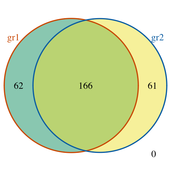
Venn diagram of overlaps for replicates
## $p.value
##      gr1 gr2 pval
## [1,]   1   1    0
##
## $vennCounts
##      gr1 gr2 Counts count.gr1 count.gr2
## [1,]   0   0      0         0         0
## [2,]   0   1     61         0        61
## [3,]   1   0     62        62         0
## [4,]   1   1    166       168       169
## attr(,"class")
## [1] "VennCounts"
Example3: visualize peak site distribution
The assignChromosomeRegion function summarizes the distribution of peaks over various features (exon, intron, enhancer, promoter and UTR).
Results can be displayed in either peak-centric or nucleotide-centric view.
Note that a single peak might span multiple type of features.
Binding site relative to features
library(TxDb.Hsapiens.UCSC.hg19.knownGene)

## get overlapping peaks:
overlaps <- ol$peaklist[["gr1///gr2"]]

## find peak site distribution:
aCR <- assignChromosomeRegion(overlaps, nucleotideLevel=FALSE,
                              precedence=c("Promoters",
                                           "immediateDownstream",
                                           "fiveUTRs",
                                           "threeUTRs",
                                           "Exons",
                                           "Introns"),
                              TxDb=TxDb.Hsapiens.UCSC.hg19.knownGene)

## use barplot to visualize:
barplot(aCR$percentage, las=3)
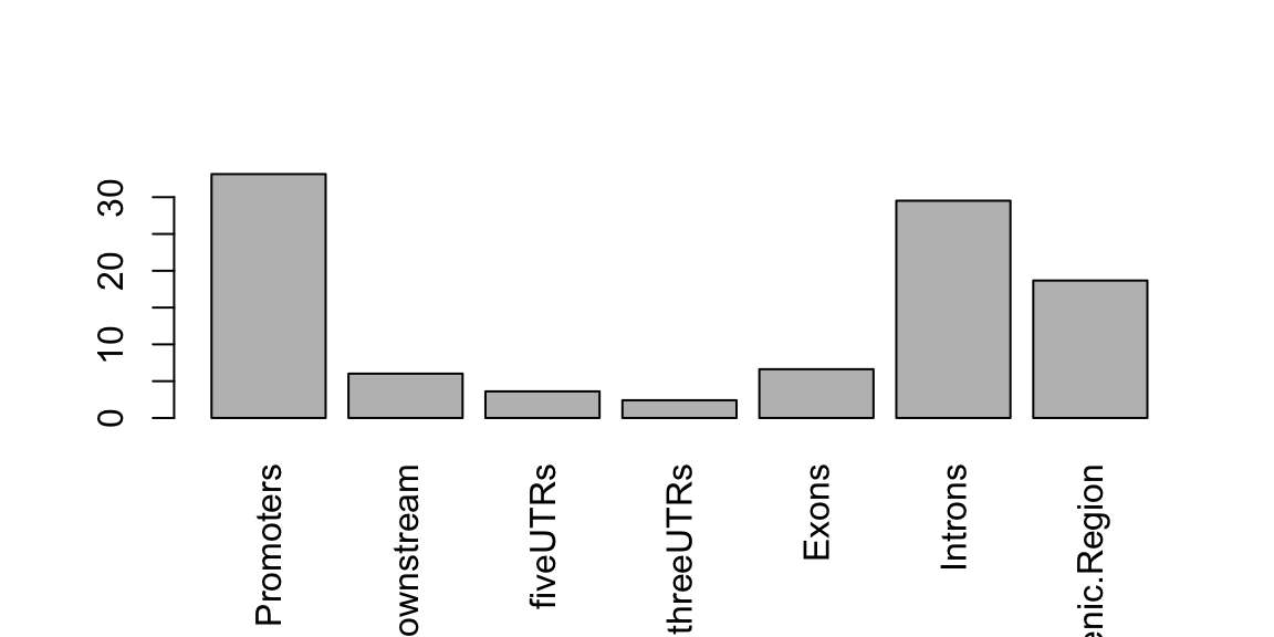
Peak distribution over different genomic features.
Peak distance distribution to nearest feature
binOverFeature(overlaps, annotationData=annoDataTxDb,
               radius=5000, nbins=20, FUN=length, errFun=0,
               ylab="count",
               main="Distribution of aggregated peak numbers around TSS")
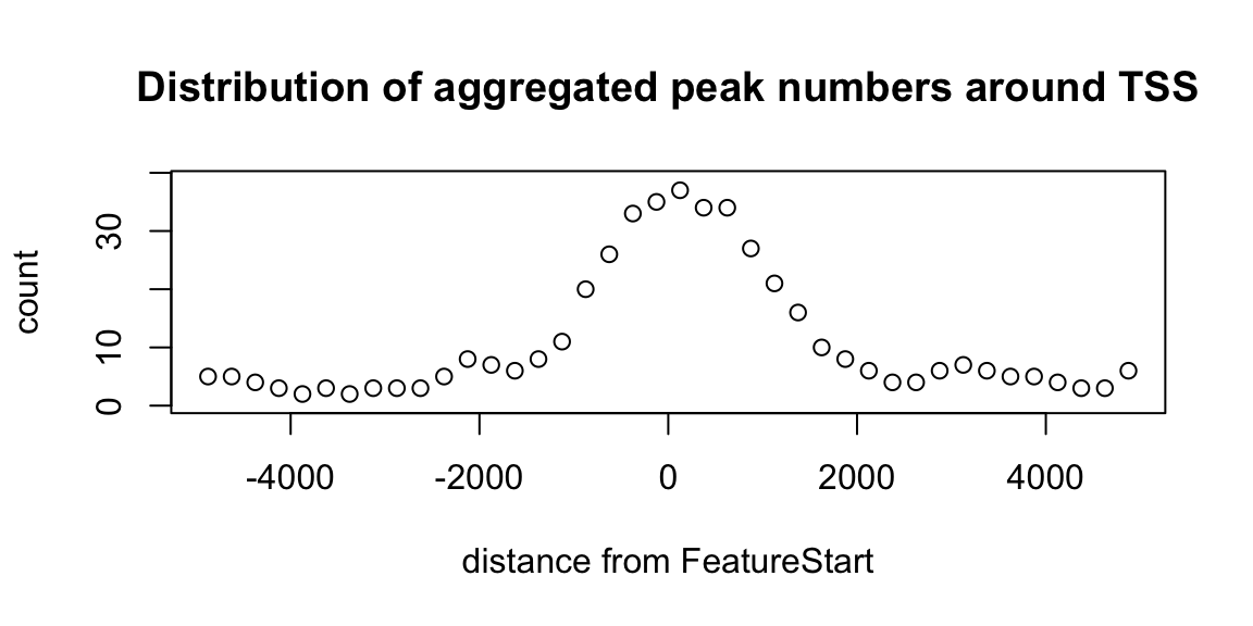
Distribution of peaks around TSS.
Annotate peaks to promoter regions (-500bp ~ +2000bp)
library(org.Hs.eg.db)

## annotate to promoter regions:
overlaps.anno <- annotatePeakInBatch(overlaps,
                                     AnnotationData=annoDataTxDb,
                                     output="nearestBiDirectionalPromoters",
                                     bindingRegion=c(-2000, 500))

## add in gene symbol:
overlaps.anno <- addGeneIDs(overlaps.anno,
                            "org.Hs.eg.db",
                            feature_id_type="entrez_id",
                            IDs2Add = "symbol")

## visualized the first two lines:
head(overlaps.anno, n=2)
## GRanges object with 2 ranges and 10 metadata columns:
##      seqnames        ranges strand |                           peakNames
##         <Rle>     <IRanges>  <Rle> |                     <CharacterList>
##   X1     chr1 713791-715578      * | gr1__MACS_peak_13,gr2__001,gr2__002
##   X4     chr1 856361-856999      * |          gr1__MACS_peak_17,gr2__005
##          score        peak     feature feature.ranges feature.strand  distance
##      <numeric> <character> <character>      <IRanges>          <Rle> <integer>
##   X1   850.203          X1   100288069  700245-714068              -         0
##   X4    54.690          X4   100130417  852953-854817              -      1543
##      insideFeature distanceToSite       symbol
##        <character>      <integer>  <character>
##   X1  overlapStart              0 LOC100288069
##   X4      upstream           1543    LINC02593
##   -------
##   seqinfo: 1 sequence from an unspecified genome; no seqlengths
Example4: find peaks with bi-directional promoters
Bi-directional promoters refer to genomic regions that are located between TSS of two adjacent genes that are transcribed on opposite directions. Bi-directional promoters often regulate both genes.
## find bi-directional promoters:
bdp <- peaksNearBDP(overlaps, annoDataTxDb, maxgap=5000)

## some statistics:
c(bdp$percentPeaksWithBDP,
  bdp$n.peaks,
  bdp$n.peaksWithBDP)
## [1] 0.05421687 166.00000000 9.00000000## show first two lines: head(bdp$peaksWithBDP, n=2)
## GRangesList object of length 2:
## $`4`
## GRanges object with 2 ranges and 10 metadata columns:
##      seqnames        ranges strand |                  peakNames     score
##         <Rle>     <IRanges>  <Rle> |            <CharacterList> <numeric>
##   X4     chr1 856361-856999      * | gr1__MACS_peak_17,gr2__005     54.69
##   X4     chr1 856361-856999      * | gr1__MACS_peak_17,gr2__005     54.69
##        bdp_idx        peak     feature feature.ranges feature.strand  distance
##      <integer> <character> <character>      <IRanges>          <Rle> <integer>
##   X4         4          X4   100130417  852953-854817              -      1543
##   X4         4          X4      148398  860530-879961              +      3530
##      insideFeature distanceToSite
##        <character>      <integer>
##   X4      upstream           1543
##   X4      upstream           3530
##   -------
##   seqinfo: 1 sequence from an unspecified genome; no seqlengths
##
## $`5`
## GRanges object with 2 ranges and 10 metadata columns:
##      seqnames        ranges strand |                  peakNames     score
##         <Rle>     <IRanges>  <Rle> |            <CharacterList> <numeric>
##   X5     chr1 859315-860144      * | gr2__006,gr1__MACS_peak_18    81.485
##   X5     chr1 859315-860144      * | gr2__006,gr1__MACS_peak_18    81.485
##        bdp_idx        peak     feature feature.ranges feature.strand  distance
##      <integer> <character> <character>      <IRanges>          <Rle> <integer>
##   X5         5          X5   100130417  852953-854817              -      4497
##   X5         5          X5      148398  860530-879961              +       385
##      insideFeature distanceToSite
##        <character>      <integer>
##   X5      upstream           4497
##   X5      upstream            385
##   -------
##   seqinfo: 1 sequence from an unspecified genome; no seqlengths
Example5: output a summary of peak consensus
Many methods are available:
Use
getAllPeakSequencemodule to output fastq file and sesarch the motif by other tools like MEME and HOMER.Compare pre-defined patterns against target consensus patterns with
summarizePatternInPeaksmodule.Calculate the z-scores for all combinations of oligonucleotide at a given length with the
oligoSmmarymodule.
Below demonstrates method 3.
library(seqinr)
library(BSgenome.Hsapiens.UCSC.hg19)

## obtain peak sequences:
seq <- getAllPeakSequence(overlaps,
                          upstream=20, downstream=20,
                          genome=Hsapiens)

## output the fasta file for the 3nd program:
#write2FASTA(seq, "test.fa")

## summarize short oligos:
os <- oligoSummary(seq, oligoLength=6, MarkovOrder=3, quickMotif=TRUE)

## plot z-scores:
zscore <- sort(os$zscore)
h <- hist(zscore, breaks=100, main="Histogram of Z-score")
text(zscore[length(zscore)], max(h$counts)/10,
     labels=names(zscore[length(zscore)]), srt=90)
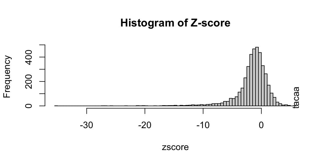
Histogram of Z-score of 6-mer
Generate motif using simulated data.
library(motifStack)

## generate the motifs:
pfms <- mapply(function(.ele, id)
               new("pfm", mat=.ele, name=paste("SAMPLE motif", id)),
               os$motifs, 1:length(os$motifs))
motifStack(pfms)
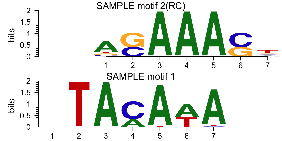
Motif of simulation data
Example6: obtain enriched GO and pathways
Please note that by default, _feature_id|type is set to “ensembl_gene_id”, is you are using TxDb for your annotation, please set to “entrez_id”.
library(reactome.db)

## obtain enriched GO term:
over <- getEnrichedGO(overlaps.anno, orgAnn="org.Hs.eg.db",
                      feature_id_type="entrez_id",
                      maxP=.05, minGOterm=10,
                      multiAdjMethod="BH", condense=TRUE)

## show first two lines:
head(over[["mf"]][, -c(3, 10)], n=2)
## [1] go.id              go.term            Ontology           pvalue
## [5] count.InDataset    count.InGenome     totaltermInDataset totaltermInGenome
## [9] EntrezID
## <0 rows> (or 0-length row.names)
## obtain enriched pathways: pathway <- getEnrichedPATH(overlaps.anno, "org.Hs.eg.db", "reactome.db", feature_id_type="entrez_id", maxP=.05) ## show the first two lines: head(pathway, n=2)
##        path.id EntrezID count.InDataset count.InGenome     pvalue
## 1 R-HSA-196849    55229               2            123 0.03029926
## 2 R-HSA-196849    65220               2            123 0.03029926
##   totaltermInDataset totaltermInGenome PATH
## 1                244            111075   NA
## 2                244            111075   NA
Example7: determine if there is significant peak overlap among multiple sets
Given multiple peak lists, to see if the binding sites are correlated and what is the common binding pattern. Two methods: hypergeometric test and permutation test.
Method 1: hypergeometric test
This method requires the number of all potential binding sites to be known. You need to set the totalTest (total potential peak number) in the makeVennDiagram module. The value should be larger than the max number of peaks in the peak list.
In the example below, we assume a 3% coding region plus promoters. Since the sample data is only a subset of chr2, we estimate that the total binding sites is 1/24 of possible binding region in the genome.
## read in data: TAF, Tead4 and YY1
path <- system.file("extdata", package="ChIPpeakAnno")
files <- dir(path, "broadPeak")
data <- sapply(file.path(path, files), toGRanges, format="broadPeak")
(names(data) <- gsub(".broadPeak", "", files))
## [1] "TAF" "Tead4" "YY1"## find overlapped peaks: ol <- findOverlapsOfPeaks(data, connectedPeaks="keepAll") ## avergage of peak width: averagePeakWidth <- mean(width(unlist(GRangesList(ol$peaklist)))) ## estimate of total binding site; tot <- ceiling(3.3e+9 * .03 / averagePeakWidth / 24) ## make Venn diagram: makeVennDiagram(ol, totalTest=tot, connectedPeaks="keepAll", fill=c("#CC79A7", "#56B4E9", "#F0E442"), col=c("#D55E00", "#0072B2", "#E69F00"), cat.col=c("#D55E00", "#0072B2", "#E69F00"))
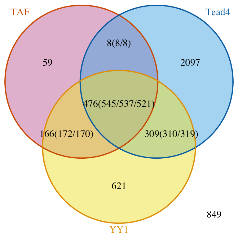
Venn diagram of overlaps.
## $p.value
##      TAF Tead4 YY1          pval
## [1,]   0     1   1  1.000000e+00
## [2,]   1     0   1 2.904297e-258
## [3,]   1     1   0  8.970986e-04
##
## $vennCounts
##      TAF Tead4 YY1 Counts count.TAF count.Tead4 count.YY1
## [1,]   0     0   0    849         0           0         0
## [2,]   0     0   1    621         0           0       621
## [3,]   0     1   0   2097         0        2097         0
## [4,]   0     1   1    309         0         310       319
## [5,]   1     0   0     59        59           0         0
## [6,]   1     0   1    166       172           0       170
## [7,]   1     1   0      8         8           8         0
## [8,]   1     1   1    476       545         537       521
## attr(,"class")
## [1] "VennCounts"
Keep first list consistent.
## set connectedPeaks to keepFirstListConsistent will show consistent total number of peaks for the first peak list.
makeVennDiagram(ol, totalTest=tot, connectedPeaks="keepFirstListConsistent",
                fill=c("#CC79A7", "#56B4E9", "#F0E442"),
                col=c("#D55E00", "#0072B2", "#E69F00"),
                cat.col=c("#D55E00", "#0072B2", "#E69F00"))
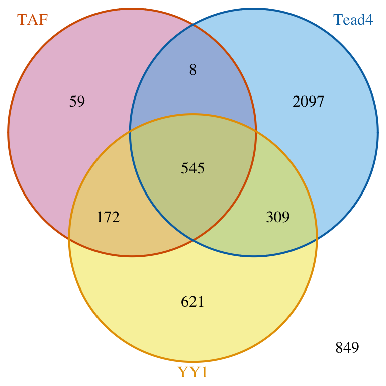
Venn diagram of overlaps for first TF.
## $p.value
## TAF Tead4 YY1 pval
## [1,] 0 1 1 1.000000e+00
## [2,] 1 0 1 2.904297e-258
## [3,] 1 1 0 8.970986e-04
##
## $vennCounts
## TAF Tead4 YY1 Counts count.TAF count.Tead4 count.YY1
## [1,] 0 0 0 849 0 0 0
## [2,] 0 0 1 621 0 0 621
## [3,] 0 1 0 2097 0 2097 0
## [4,] 0 1 1 309 0 310 319
## [5,] 1 0 0 59 59 0 0
## [6,] 1 0 1 166 172 0 170
## [7,] 1 1 0 8 8 8 0
## [8,] 1 1 1 476 545 537 521
## attr(,"class")
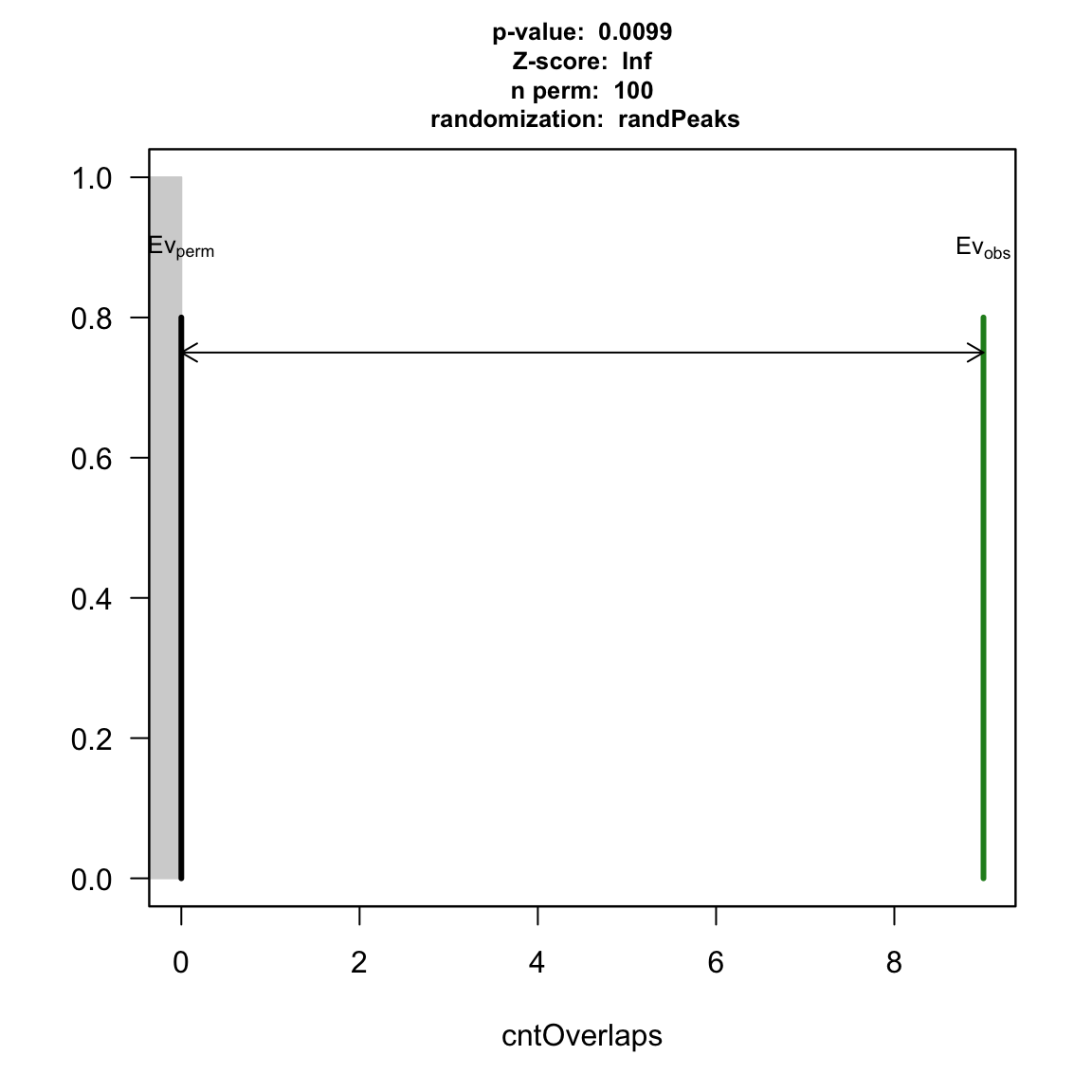
## [1] "VennCounts"Method 2: Permutation test
With peakPermTest, users don’t need to estimate total potential binding sites.
Before permutation test, random peaks need to be generated using the distribution discovered from the input peak for a given feature type. Alternatively, a peak pool can be prepared with preparePool module. Below is an exmple using the transcription factor binding site clusters (V3) (see ?wgEncodeTfbsV3) downloaded from ENCODE with the HOT spots (?HOT.spots) removed.
HOT spots are regions with probability to be bound by many TFs. We suggest to remove them before the test. Users can also choose to remove blacklist ENCODE blacklist regions. Note that some blacklists need to be converted to the correct genome assembly with liftover utility.
## read in data:
data(HOT.spots)
data(wgEncodeTfbsV3)
hotGR <- reduce(unlist(HOT.spots))

## remove HOT spots:
removeOl <- function(.ele){
    ol <- findOverlaps(.ele, hotGR)
    if(length(ol)>0) .ele <- .ele[-unique(queryHits(ol))]
    .ele
}
TAF <- removeOl(data[["TAF"]])
TEAD4 <- removeOl(data[["Tead4"]])
YY1 <- removeOl(data[["YY1"]])

## subset to save demo time:
set.seed(1)
wgEncodeTfbsV3.subset <- wgEncodeTfbsV3[sample.int(length(wgEncodeTfbsV3), 2000)]

## YY1 vs TEAD4:
pool <- new("permPool", grs=GRangesList(wgEncodeTfbsV3.subset), N=length(YY1))
pt1 <- peakPermTest(YY1, TEAD4, pool=pool, seed=1, force.parallel=FALSE)
plot(pt1)

permutation test for YY1 and TEAD4
## YY1 vs TAF:
pt2 <- peakPermTest(YY1, TAF, pool=pool, seed=1, force.parallel=FALSE)
plot(pt2)
permutation test for YY1 and TAF
Example8: metagene analysis for a given feature/peak range
You can easily visualize and compare the binding patterns of raw signals of multiple ChIP-seq experiments using function featureAlignedHeatmap and featureAlignedDistribution.
Heatmap of aligned features.
library(rtracklayer)

## recenter features:
features <- ol$peaklist[[length(ol$peaklist)]]
feature.recentered <- reCenterPeaks(features, width=4000)

## read in data:
path <- system.file("extdata", package="ChIPpeakAnno")
files <- dir(path, "bigWig")
if(.Platform$OS.type != "windows"){
    cvglists <- sapply(file.path(path, files), import,
                       format="BigWig",
                       which=feature.recentered,
                       as="RleList")
} else {
    load(file.path(path, "cvglist.rds"))
}

## extract signal:
names(cvglists) <- gsub(".bigWig", "", files)
feature.center <- reCenterPeaks(features, width=1)
sig <- featureAlignedSignal(cvglists, feature.center,
                            upstream=2000, downstream=2000)

## output heatmap
keep <- rowSums(sig[[2]]) > 0
sig <- sapply(sig, function(.ele) .ele[keep, ], simplify = FALSE)
feature.center <- feature.center[keep]
heatmap <- featureAlignedHeatmap(sig, feature.center,
                                 upstream=2000, downstream=2000,
                                 upper.extreme=c(3,.5,4))
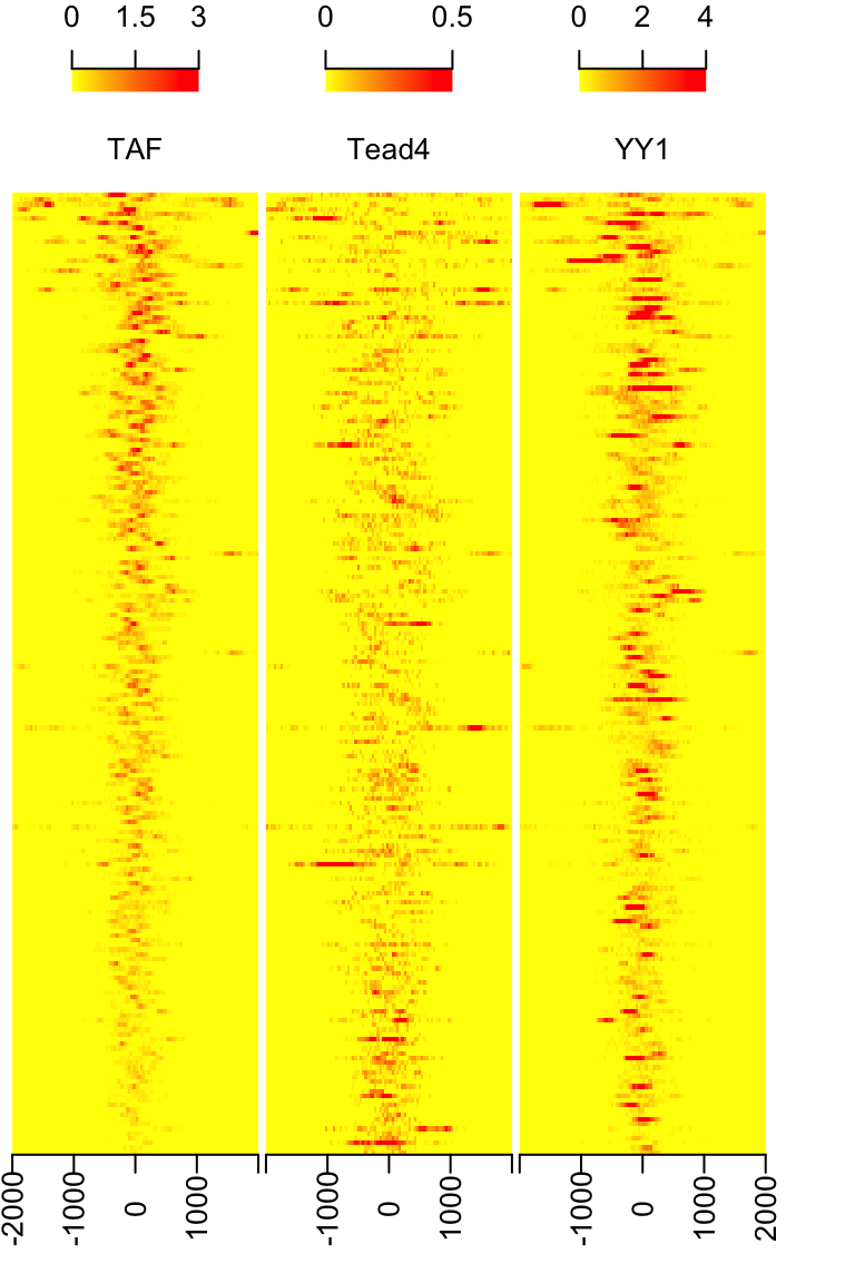
Heatmap of aligned features sorted by signal of TAF
Distriution of aligned features.
featureAlignedDistribution(sig, feature.center,
                           upstream=2000, downstream=2000,
                           type="l")
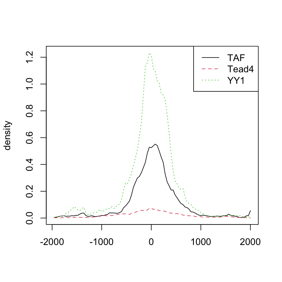
Distribution of aligned features
Example9: creating lollipop plot with trackViewer
It is routine to show the distribution of mutation or genetic variations by lollipop-style (or needle-style) plot in a genome browser, along with a variety of genomic annotations, such as gene or exon level models, CpG island, and so on.
For SNP status or methlyation data, lollipop plot is often used. Many tools can provide lollipop plot such as cBioPortal Tools::MutationMapper1, EMBL-EBI::Pfam2, and BioJS::muts-needle-plot3, BiQ Analyzer4, and Methylation plotter5. The cBioPortal Tools::MutationMapper is a well-known and easy to use online genome browser that can generate high quality figures with mutations by inputing tab-delimited mutation data. In R/Bioconductor, with the Rgraphics system, there are many flexible ways to display methylation data such as MethVisual6, REDseq7, and GenVisR8.
Below is a summary of current tools that are available.
| software | inputs | online | description |
|---|---|---|---|
| MutationMapper1 | tab-delimited text | Yes | interprets mutations with different heights along protein annotations in automatic color theme |
| Pfam2 | JSON | Yes | could combine different line and head colors with different drawing styles |
| muts-needle-plot3 | JSON | No | plots data point with different colors, heights, and size along annotations, and highlighted selcted coordinates |
| BiQ Analyzer4 | BiQ methylation file | Yes | interprets methylation status in black & white |
| Methylation plotter5 | tab-delimited text | Yes | stacked multiple methylation status for multiple samples |
| MethVisual6 | R list | No | visualize the methylation status of CpGs according to their genomic position |
| REDseq7 | R list | No | plot frequencies of methylations and SNPs along a chromosome |
| GenVisR8 | R dataframe | No | plot most accurate graphic representation of the ensembl annotation version based on biomart service |
Though the tools above meet the basic even advanced visualization requirement, they do have limitations. For example, it will be hard to display the data if there are multiple mutations in the same posistion. Moreover, generating high quality pictures in bunch for publication is also a pain.
To fill this gap, we developed trackViewer, a R/Bioconductor package serving as an enhanced light-weight genome viewer for visualizing various types of high-throughput sequencing data, side by side or stacked with multiple annotation tracks.
Besides the regular read coverage tracks supported by existing genome browsers/viewers, trackViewer can also generate lollipop plot to depict the methylation and SNP/mutation status, together with coverage data and annotation tracks to facilitate integrated analysis of multi-omics data. In addition, figures generated by trackViewer are interactive, i.e., the feel-and-look such as the layout, the color scheme and the order of tracks can be easily customized by the users. Furthermore, trackViewer can be easily integrated into standard analysis pipeline for various high-throughput sequencing dataset such as ChIP-seq, RNA-seq, methylation-seq or DNA-seq. The images produced by trackViewer are highly customizable including labels, symbols, colors and size. Here, we illustrate its utilities and capabilities in deriving biological insights from multi-omics dataset from GEO/ENCODE.
There are 3 steps for generating lollipop plot:
Prepare the methylation/variant/mutation data.
Prepare the gene/protein model.
Plot lollipop plot.
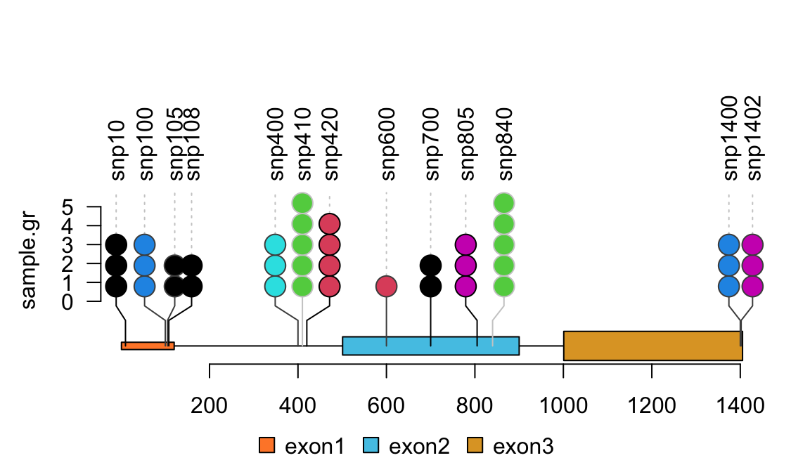
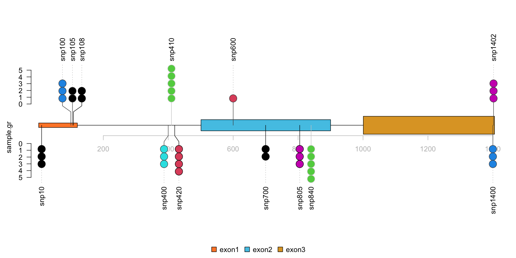
Step1: repare the methylation/variant/mutation data.
library(trackViewer)

set.seed(123)

# Here we use SNP sample data
SNP <- c(10, 100, 105, 108, 400, 410, 420, 600, 700, 805, 840, 1400, 1402)
# use GenomicRanges::GRanges function to create a GRanges object.
# for real data, users can import vcf data via VariantAnnotation::readVcf function.
sample.gr <- GRanges("chr1", IRanges(SNP, width=1,
                     ## the name of GRanges object will be used as label
                     names=paste0("snp", SNP)),
                     ## score value will be used to for the height of lollipop
                     score = sample.int(5, length(SNP), replace = TRUE),
                     ## set the color for lollipop node.
                     color = sample.int(6, length(SNP), replace = TRUE),
                     ## set the lollipop stem color
                     border = sample(c("black", "gray80", "gray30"),
                     length(SNP), replace=TRUE))
Example10: plot from VCF file with trackViewer
VCF is a text file format that contains metadata and mutation information about genomic positions, original genotypes and optional genotypes.
The trackViewer package can show single nucleotide polymorphisms (SNPs) from VCF file in lollipop plot. Figure @ref(fig:plotVCFdata) shows an example lollipop plot of real SNPs. Sample SNPs are a subset of 1000 variants and 50 samples from chromosome 22 taken from 1000 Genomes in VCF in the VariantAnnotation package. Different colors depict the new SNP events in the circles. The number of circles indicates the number of SNP events.
library(VariantAnnotation) ## load package for reading vcf file
library(TxDb.Hsapiens.UCSC.hg19.knownGene) ## load package for gene model
library(org.Hs.eg.db) ## load package for gene name
library(rtracklayer)

fl <- system.file("extdata", "chr22.vcf.gz", package="VariantAnnotation")
## set the track range
gr <- GRanges("22", IRanges(50968014, 50970514, names="TYMP"))
## read in vcf file
tab <- TabixFile(fl)
vcf <- readVcf(fl, "hg19", param=gr)

## get GRanges from VCF object
mutation.frequency <- rowRanges(vcf)
## keep the metadata
mcols(mutation.frequency) <-
    cbind(mcols(mutation.frequency),
          VariantAnnotation::info(vcf))

## set colors
mutation.frequency$border <- "gray30"
mutation.frequency$color <-
    ifelse(grepl("^rs", names(mutation.frequency)),
           "lightcyan", "lavender")

## plot Global Allele Frequency based on AC/AN
mutation.frequency$score <- round(mutation.frequency$AF*100)
## change the SNPs label rotation angle
mutation.frequency$label.parameter.rot <- 45
## keep sequence level style same
seqlevelsStyle(gr) <- seqlevelsStyle(mutation.frequency) <- "UCSC"
seqlevels(mutation.frequency) <- "chr22"

## extract transcripts in the range
trs <- geneModelFromTxdb(TxDb.Hsapiens.UCSC.hg19.knownGene,
                         org.Hs.eg.db, gr=gr)

## subset the features to show the interested transcripts only
features <- c(range(trs[[1]]$dat), range(trs[[5]]$dat))
## define the feature labels
names(features) <- c(trs[[1]]$name, trs[[5]]$name)
## define the feature colors
features$fill <- c("lightblue", "mistyrose")
## define the feature heights
features$height <- c(.02, .04)
## set the legends
legends <- list(labels=c("known", "unkown"),
                fill=c("lightcyan", "lavender"),
                color=c("gray80", "gray80"))
## lollipop plot
lolliplot(mutation.frequency,
          features, ranges=gr, type="circle",
          legend=legends)
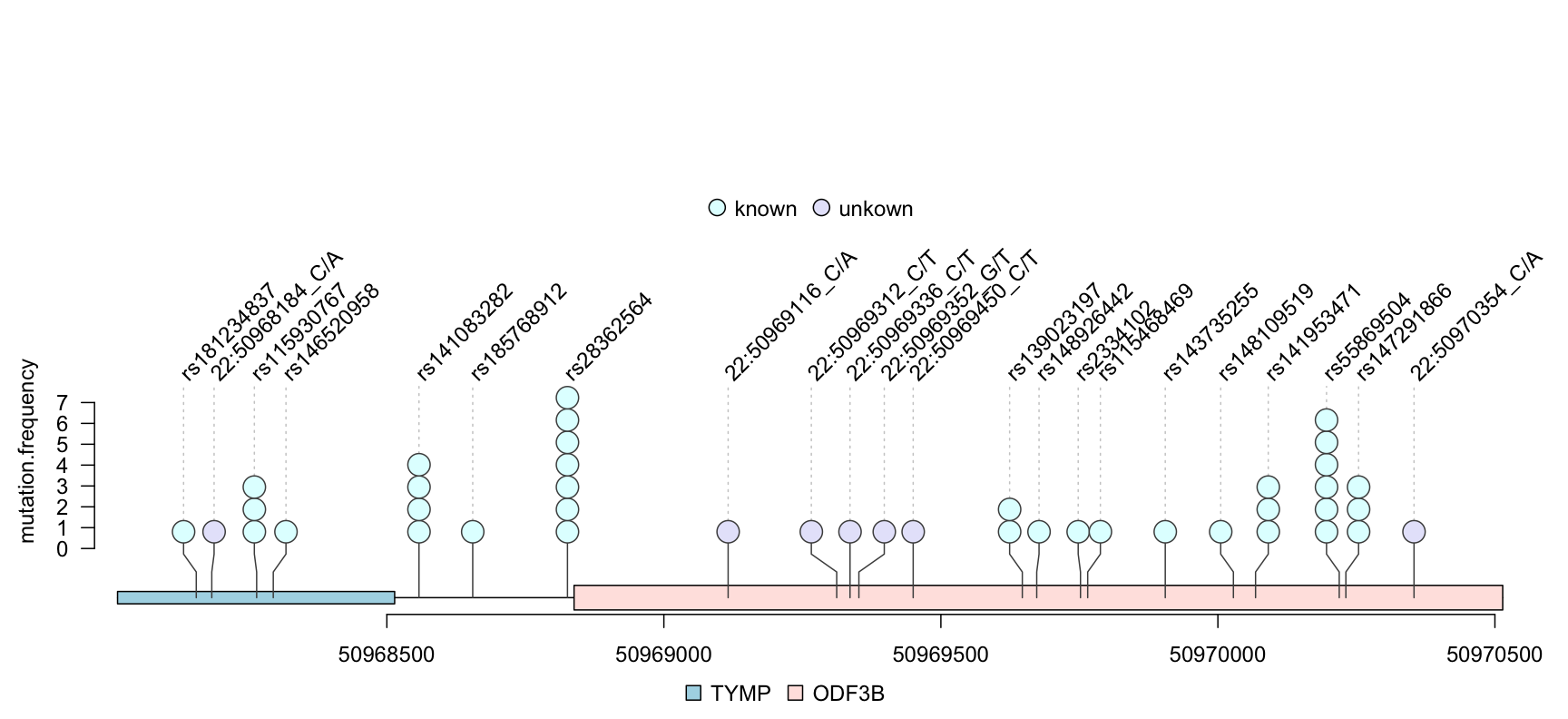
lollipop plot for VCF data
Example11: plot methylation data from BED file with trackViewer
Any type of data that can be imported into a GRanges object can be viewed by trackViewer package.
Sample methylations are random data generated for illustration and are saved in BED format file. The rtracklayer package is used to import the methylation data into a GRanges. The transcripts are extracted from TxDb object and are assigned gene symbol with org database. We also demonstrate that multiple transcripts can be shown in different colors and tracks.
library(TxDb.Hsapiens.UCSC.hg19.knownGene) ## load package for gene model
library(org.Hs.eg.db) ## load package for gene name
library(rtracklayer)

## set the track range
gr <- GRanges("chr22", IRanges(50968014, 50970514, names="TYMP"))
## extract transcripts in the range
trs <- geneModelFromTxdb(TxDb.Hsapiens.UCSC.hg19.knownGene,
                         org.Hs.eg.db, gr=gr)
## subset the features to show the interested transcripts only
features <- GRangesList(trs[[1]]$dat, trs[[5]]$dat, trs[[6]]$dat)
flen <- elementNROWS(features)
features <- unlist(features)

## define the feature track layers
features$featureLayerID <- rep(1:2, c(sum(flen[-3]), flen[3]))
## define the feature labels
names(features) <- features$symbol
## define the feature colors
features$fill <- rep(c("lightblue", "mistyrose", "mistyrose"), flen)
## define the feature heights
features$height <- ifelse(features$feature=="CDS", .04, .02)
## import methylation data from a bed file
methy <- import(system.file("extdata", "methy.bed", package="trackViewer"), "BED")
## subset the data to simplify information
methy <- methy[methy$score > 20]
## for pie plot, there are must be at least two numeric columns
methy$score2 <- max(methy$score) - methy$score
## set the legends
legends <- list(labels=c("methylated", "unmethylated"),
                fill=c("white", "lightblue"),
                color=c("black", "black"))

## lollipop plot, pie layout
lolliplot(methy, features,
          ranges=gr, type="pie",
          legend=legends)
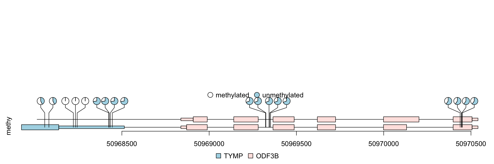
lollipop plot, pie layout
Example12: plot lollipop plot for multiple patients in “pie.stack” layout with trackViewer
The percentage of methylation rates are shown by pie graph in different layers for different patients.
## simulate multiple patients
rand.id <- sample.int(length(methy), 3*length(methy), replace=TRUE)
rand.id <- sort(rand.id)
methy.mul.patient <- methy[rand.id]

## pie.stack require metadata "stack.factor", and the metadata can not be stack.factor.order or stack.factor.first
len.max <- max(table(rand.id))
stack.factors <- paste0("patient",
                        formatC(1:len.max,
                                width=nchar(as.character(len.max)),
                                flag="0"))
methy.mul.patient$stack.factor <-
    unlist(lapply(table(rand.id), sample, x=stack.factors))
methy.mul.patient$score <-
    sample.int(100, length(methy.mul.patient), replace=TRUE)

## for a pie plot, two or more numeric meta-columns are required.
methy.mul.patient$score2 <- 100 - methy.mul.patient$score
## set different color set for different patient
patient.color.set <- as.list(as.data.frame(rbind(rainbow(length(stack.factors)),
                                                 "#FFFFFFFF"),
                                           stringsAsFactors=FALSE))
names(patient.color.set) <- stack.factors
methy.mul.patient$color <-
    patient.color.set[methy.mul.patient$stack.factor]

## set the legends
legends <- list(labels=stack.factors, col="gray80",
                fill=sapply(patient.color.set, `[`, 1))

## lollipop plot
lolliplot(methy.mul.patient,
          features, ranges=gr,
          type="pie.stack",
          legend=legends)
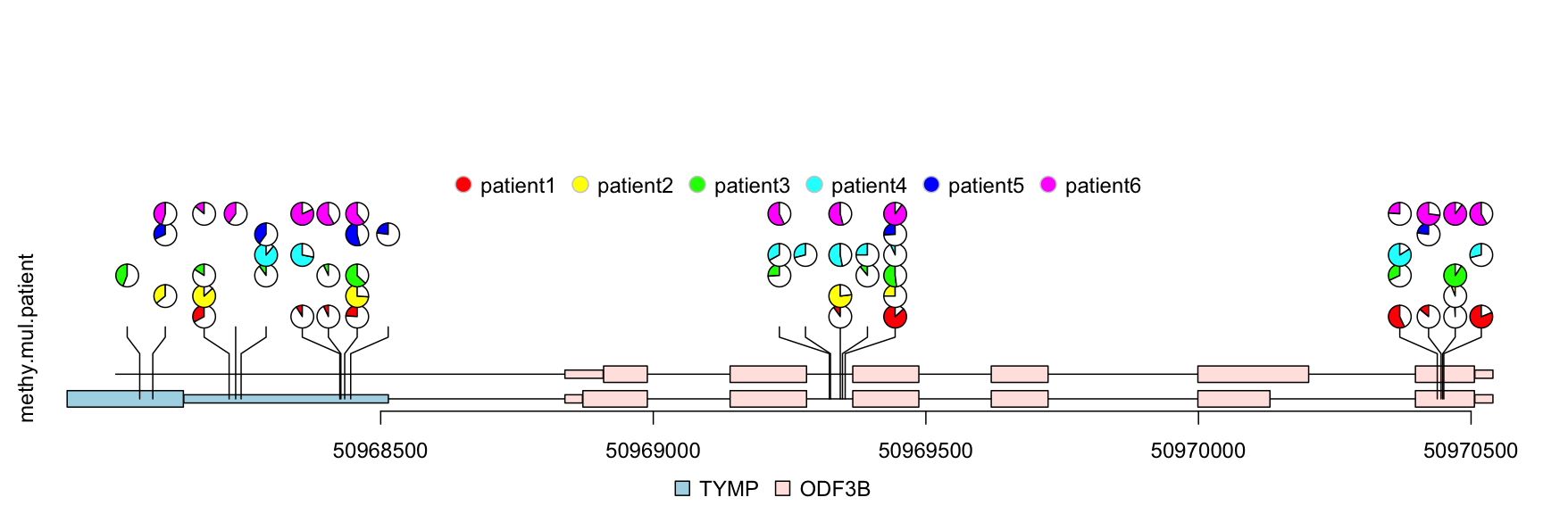
lollipop plot, pie.stack layout
Example13: plot lollipop plot in caterpillar layout to compare two samples with trackViewer
The caterpillar layout can be used to compare two samples or to display dense data side by side.
## use SNPsideID to set the layer of event
sample.gr$SNPsideID <- sample(c("top", "bottom"),
                               length(sample.gr),
                               replace=TRUE)
lolliplot(sample.gr, features.gr)
lollipop plot, caterpillar layout
Example14: dandelion plot hundreds SNPs with trackViewer
Sometimes, there are as many as hundreds of SNPs or methylation status involved in one gene. Dandelion plot can be used to depict such dense SNPs or methylation. Please note that the height of the dandelion indicates the density of the events.
methy <- import(system.file("extdata", "methy.bed", package="trackViewer"), "BED")
length(methy)
## [1] 38## set the color of dandelion leaves. methy$color <- 3 methy$border <- "gray" ## we suppose the total event are same (methy + unmethy) ## we rescale the methylation score by max value of the score m <- max(methy$score) methy$score <- methy$score/m # The area of the fan indicate the percentage of methylation or rate of mutation. dandelion.plot(methy, features, ranges=gr, type="fan")
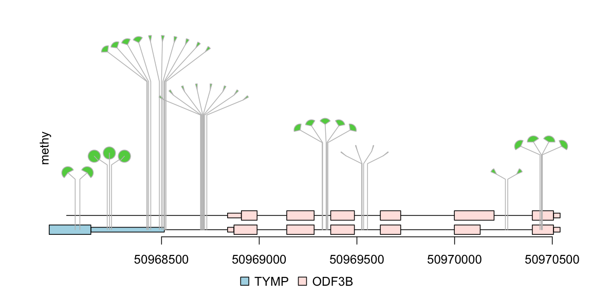
dandelion plot
1. Gao, J. et al. Integrative analysis of complex cancer genomics and clinical profiles using the cBioPortal. Science signaling 6, pl1 (2013).
2. Finn, R. D. et al. Pfam: Clans, web tools and services. Nucleic acids research 34, D247–D251 (2006).
3. Schroeder, M. P. Muts-needle-plot: Mutations needle plot v0.8.0. (2015). doi:10.5281/zenodo.14561
4. Bock, C. et al. BiQ analyzer: Visualization and quality control for dna methylation data from bisulfite sequencing. Bioinformatics 21, 4067–4068 (2005).
5. Mallona, I., Díez-Villanueva, A. & Peinado, M. A. Methylation plotter: A web tool for dynamic visualization of dna methylation data. Source code for biology and medicine 9, 1 (2014).
6. Zackay, A. & Steinhoff, C. MethVisual-visualization and exploratory statistical analysis of dna methylation profiles from bisulfite sequencing. BMC research notes 3, 337 (2010).
7. Zhu, L. & others. REDseq: A bioconductor package for analyzing high throughput sequencing data from restriction enzyme digestion.
8. Skidmore, Z. L. et al. GenVisR: Genomic visualizations in r. Bioinformatics btw325 (2016).